Robots and AI are expected to operate more seamlessly within the human world. To achieve this, scientists have begun outfitting technology with the same sensors that human beings use. Those sensors, more commonly known as the five senses, are sight, hearing, taste, smell, and touch. In this series, WIRED Brand Lab explores the senses that are being developed for technology so that these objects can better operate within the human world and humans can better interact with the virtual world.
Chi-Town follows Keifer Sykes on his meteoric rise from Marshall High School on Chicago's West Side to his improbable shot at the NBA. This exhilarating multi-year journey of the explosive point guard's ascent is punctuated by personal loss, debilitating injury, and tragic violence. This is an intimate, raw, surprising and unique behind the scenes look at a true champion – and what it really takes to make it.
This poster was developed as the promotional materials for the film’s debut at the South by Southwest Festival in Austin, Texas. The world-famous skyline of Chicago was composited onto a heroic shot of the main star, Keifer Sykes. This designed was pushed even featuring special moments that occur in the film within the skyline as well without giving too much away. The film has traveled to many different festivals around the globe and even snagged a few awards along the way.
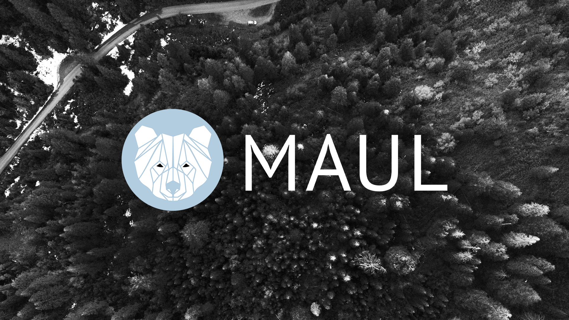
MAUL ST is an all-in-one, Emmy award winning production house specializing in the creation of high-end content for televison, digital, and commercial outlets. They have over 25 years of entertainment experience.
A logomark and logotype were developed to breathe new life into Maul’s existing brand. A geometric bear inspired by the word Maul paired with a simple san-serif were used to create a timeless yet sophisticated logo.
This series was inspired by the lyrics from “Brown Skin Girl” by Beyoncé, Blue Ivy, SAINt JHN, and WizKid.
It felt empowering to use a model that does not identify as a model. Fashion is incredibly transforming. It has a way of revealing a power inside that I believe we all possess. This series is a celebration of the beauty that is brown skin.
Art Direction: Kamon Cash
Stylist: Kamon Cash
Model: Ashlyn Diaz
Retoucher: Yousuf Abidi
GFX: Kamon Cash
Font designed by David Kerkhoff.
Save The Bees is an initiative that Street Team Studios is incredibly passionate about. This honey-themed box was developed and sent out to our top customers during this promotional period.
The box includes Honey Soap, Honey Lip Balm, Local Wildflower Honey, a Honey Dipper, Honey Lollipops, a Honey Candle, Jack Daniels Honey, and of course Wildflower Seeds.
Almost 100 pounds of wildflower seeds were sent out to be planted. Together we can make a difference and positive impact on our planet.
Pure/Copper was inspired by the title “Pure/Honey” from the Renaissance album. This series celebrates turning 29. As the atomic number of Copper is 29, it felt appropriate as a theme for this year.
It is important to me to mark progression. In doing an annual birthday photoshoot, it illustrates growth while flexing my creative skill set.
A remote trigger, Copper metallic paint by Mehron, and a Godox AD200 were used to capture these images. Light retouching and post-production gfx were the final touch to elevate this series for social.
Art Direction: Kamon Cash
Photographer: Kamon Cash
Model: Kamon Cash
GFX: Kamon Cash
A collection of macro photographs that celebrate the beauty of nature. Kamon Cash's photographs capture a new world that is often overlooked in an incredible way. Get a fresh perspective of the textures, colors, and minute details nature has to offer at this magnification.
View Blurb Listing HERE
• Hardcover Image Wrap
• Premium Lustre Paper
• ISBN: 9781034400387
Entire Photobook available HERE for purchase on Amazon!
Justine Cosmetics is a cosmetic line developed and founded by Demi Lee.
The brand has one mission: to provide diversity, inclusion, and makeup for ALL.
This project illustrates the logo that was created for Justine Cosmetics as well as product photography for the brand that was art directed and shot by me. The concept of these shots is actually quite simple. I wanted to highlight the various products in this line in a way that felt somewhat luxurious yet also attainable.
This poster series was inspired by SHOW US YOUR TYPE, a project developed as a creative platform for designers to share their talents and explore cities from a different perspective.
This selection of cities are places I have traveled to or would someday like to visit. I collected my personal experiences, experiences from friends/family, and visual research to inspire the design for each poster. The beauty of this method is that it can yield an endless amount of design solutions. In that way, I used this as a sort of personal creative warm-up to break up the monotony that can sometimes come from being stuck in a rut.
Street Team Studios is a rental company that strives on building strong reliable bonds with their clients. It all began with a box fan and has since expanded to its position today as a one-stop shop for all things production.
A logo design was initially created for the brand that later evolved into stickers. These stickers can be found all around NYC.
‘Morning Coffee’ is a typographic poster series that features personal words of affirmation. The name was inspired by the connection I have to each phrase, which I found comparable to the daily cup of coffee that keeps me going.
This project serves as both a stylistic exploration of typography/design and source of constant motivation.
Finite is an awareness campaign that ultimately hoped to inspire consumers to be more conscious of the clothes they buy; paying particular attention to where they are sourced and the affect they have on the environment.
This project was inspired by the current need to develop better habits for the world. The name Finite was chosen because it leaves an impression that the resources we use everyday are in fact, limited. This project featured a logo*, app, brochure, sweater, package design, and advertisements.
*Logo developed using typeface originally designed by Antonio Rodrigues Jr.
This ring design was inspired by Daniel Arsham's "The Future Was Then" installation at the SCAD Museum of Art. This installation featured a water droplet that was used for the overall shape of the ring as well as the material choice. (Vero Clear Plastic)
The objective was to develop a final ring that would be 3D printed with a pre-assembled movable part. In other words, I was not able to print separate pieces and assemble them after printing. This project allowed me to learn how to model in Rhino, explore 3D printed materials, utilize material properties/standards, and design a product from sketch to prototype using Shapeways.
Each year my birthday is used to not only mark another year around the sun but to evaluate where I am in relationship to my overall goals. As twenty-five seems like quite the milestone, I found it fitting to share some of the lessons I have learned along the way as a faux magazine cover and 5-page editorial spread.
I worked closely with photographer Kevyn Mines, who shot and retouched each photo of the project. This project gave me the opportunity to art direct my poses and lighting, as well as style myself. I always find utilizing multiple skills sets to be most creatively fulfilling projects.
Tiro de Verdad (Shot of Truth) is a packaging project that consists of an outer container and taster sample of tequila. This project features three 750ml bottles playing off of the concept of tequila, which is known as an alcohol that gets people to tell their secrets. This idea of a truth serum was referenced to create all accessory graphics for the bottles and the outer packaging doubles as an actual lie detector test.
The accessory graphics vary from bottle to bottle depending on the strength of the tequila it contains. For instance, Blanco tequila is less aged and therefore less potent than Añejo. This fact was referenced to develop varying rates of truth extraction across the entire product line. Each Cîroc bottle was coated with Montana Black spray paint and covered with labels featuring graphics that were created in Illustrator.
HALT is a 7-part kit that targets individuals who are struggling with shopping problems. This project was inspired by my very own need to stop shopping so much. This kit features things that would remind and aid a shopaholic to incorporate better habits in their daily life. The color palette was inspired by a trend board for Menswear SS 2015 that featured bold, bright suiting. This project seduces the shopaholic with things they would normally gravitate towards but to their surprise informs them to stop shopping.
Each of the objects featured in this 7-part kit would in some way remind the person who interacts with it to remain motivate. With all of the advertising we come in contact with each day, it can be very easy to continue to shop. This kit features a faux shopping bag, welcome letter, a frame, a credit card, a journal, stress balls, and a faux gift card. Photography, pattern, color, and design elements were combined in Photoshop to create the accessory graphics for this project.
This zine is all handmade excluding the photocopied images related to the Triangle Shirtwaist Factory Fire. This zine was created to document a story that relates to specific issues from the late 1800s and early 1900s. It also served as a temporary break from the computer, which is always a great idea. I believe that computers are merely a tool and should only be used as such. Creativity happens when one continuously explores and approaches innovation with an open mind from multiple perspectives.
The main character Rosa is the daughter of Catherine Maltese, a woman who died in the factory fire. The zine focuses on the working conditions at Triangle Shirtwaist Factory, the day of the fire, and the overall affect of the event from Rosa's perspective. Each page was burned to add to handmade feeling as well as reference the fire that took place in the Asch building. Lastly, light washes of gouache were used to emphasize certain elements, especially the interactive elements.
Hip Hop Weekly is an American hip hop news and entertainment magazine founded in 2006. The magazine covers celebrity news, music, film, fashion, sports and features exclusive interviews with many notable figures within popular culture. The current design is reminiscent of a tabloid magazine, which is very off-putting. This solution was designed as a rebrand for Hip Hop Weekly with the intention of connecting with a wider market.
This rebrand includes a magazine cover, two content pages, and a spread about Beyoncé Knowles. A rounded logotype was created for a more approachable feeling. This logotype also featured a bold color that is very new for Hip Hop Weekly. In the feature spread, Beyoncé described the creation, ideation, and personal feelings she had about her self-titled album.
This HIV/AIDS poster series was created in hopes of inspiring people to get tested. After doing some research, I discovered that many people are unaware of their status and unwittingly pass it on to others. I aim to reach those people before it is too late. The designs for each poster was approached by first referencing the top reasons that people resist getting tested.
Fred Demara, Richard Lockey, and Scott Trimble shared their expert opinions on insects in these volumes of the Smithsonian Field Guide to Insects. Three book jackets were developed for field guides that discuss insects that are edible, helpful, and poisonous. This field guide provided a suite of modern tools to effectively aid in the identification of more than 750 species of insects across North America. It concisely gathered a collection of information about insects into three portable and well-organized volumes.
A muted palette was chosen for these covers to create a cohesive natural color scheme. Each book cover featured an insect that spans almost the whole length of the book jacket. The matte black insects are placed in the foreground and being accompanied by a very energetic, expressive print that mimics the motion of an insect. This print intentionally used pixelation to further express and capture the insect’s movements.
Elevar is a packet that consist of a business card, floor plans, and a spread that explains an upcoming proposal for the construction of luxury condominiums. Greed normally has a negative connotation but this project challenges that by explaining that if you are greedy with your time, craft, attention, and energy you can one day live in “the penthouse”.
This project explores the positive use of greed while playing on the concept of building towards better and better. Essentially, the booklet is designed to express the attitudes of greed and how that energy can be channeled to produce something great. The design elements become more elaborate and sophisticated as they approach the penthouse suite level.
W.I.P.